


Yahoo debuts slimmer logo but keeps trademark exclamation point
Yahoo updated its logo late on Wednesday night, and while the lettering was slimmer than before, the company has retained the yodel-like exclamation mark and purple colour. The logo came after a month-long countdown of proposed logo designs.<br />

Yahoo updated its logo late on Wednesday night, and while the lettering was slimmer than before, the company has retained the yodel-like exclamation mark and purple colour. The logo came after a month-long countdown of proposed logo designs.
[caption id="attachment_1087713" align="alignleft" width="380"]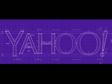 The new Yahoo logo. Image courtesy Yahoo[/caption]
"We wanted a logo that stayed true to our roots (whimsical, purple, with an exclamation point) yet embraced the evolution of our products," Yahoo chief marketing officerKathy Savittsaid in aTumblrblog post. The logo shows the letters spelling 'Yahoo!' in purple with no letters touching.
The redesign is the latest step in a Yahoo-makeover which has been underway since former Google executive Marissa Mayer became CEO over a year ago. Besides the logo, the Yahoo front page, Flickr photo-sharing and email have also been renovated in the recent past.
On Marissa Mayer's tumblr, the CEO spoke about how the new logo reflected the qualities of Yahoo!: "Whimsical, yet sophisticated. Modern and fresh, with a nod to our history. Having a human touch, personal. Proud," says her website.
 More from News Analysis
You can check out the design notes Yahoo worked with in the video below, or track the 30-day logo countdown here.

Why AI notetakers are raising serious privacy and security concerns
China's low-cost AI models are changing the global AI race. Here's why Silicon Valley is worried
China's Kimi K3 challenges US AI leaders with frontier-level performance at lower cost
How did Instagram run ads promoting child abuse in India?
Why has India halted WhatsApp’s username feature before launch?